
Arsenal Homepage Redesign
TOOLS
Figma
ROLE
TEAM
DATE
Content Strategy
Interaction Design
Visual/UI Design
Prototyping
Myself
2026
DURATION
1 week
A homepage redesign for Arsenal.com, focused on cleaning up clutter, repetition and restructuring the navigation around user intent rather than internal content silos. I audited the existing site, identified structural and visual pain points, and rebuilt the homepage in Figma.
Overview
I went through the homepage where I identified and annotated potential pain points, including the following:
No priority content near the top - no next-fixture countdown, or ticket CTA above the fold; the first thing on the page is a generic news carousel
Repeated section pattern with no variation - the same headline-card-plus-4-grid layout is reused 10+ times down the page, so nothing visually signals "this is more important than that"
Men's/Women's/Academy content duplicated as full parallel sections - "Top Stories," "Women's News," and "Academy News" each get their own near-identical News + Video block
Commerce interrupts editorial flow - "Shop Now" and a kit ad banner are dropped mid-scroll between unrelated news sections rather than living in one place
Two-tier header with inconsistent styling - a secondary utility row (Hospitality, Accessibility, Stadium Tours, etc.) sits above the main nav in noticeably smaller, mismatched text, reading as two disconnected systems rather than one
Nav items aren't logically grouped - related sections (Tickets, Membership) sit apart with no clear order guiding the eye
Inconsistent caption styling across cards - text size and weight shift from section to section, and icon/stat placement moves depending on headline length, breaking row alignment
Unclear content grouping - some image rows (e.g. the second row under "Top Stories") don't visually register as part of their parent section.
Templated, repetitive CTAs - every product card repeats an identical "SHOP NOW" button with no variation, and the carousel arrow isn't vertically centered against the row
Vague call-to-action labels - "VIEW ALL" doesn't indicate what it leads to.
Inconsistent spacing rhythm - a large gap appears right before the footer that doesn't match the tighter spacing used everywhere else on the page.
Mismatched footer treatment - partner logos render in inconsistent shades/styles, giving the page an inconsistent finish at the bottom.
Excessive total length - 14+ distinct sections stacked before the footer.
The Problem
My Solution

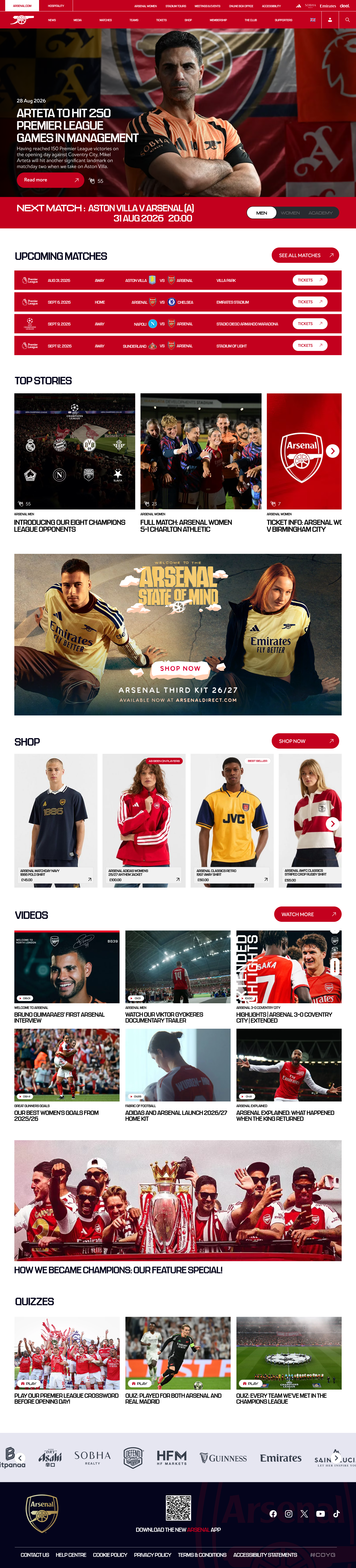
This is the amount of space saved scrolling with the new design.
The Results
Increased header size and prominence - Enlarged both arts of the header so each part reads as inviting and usable, rather than one feeling like an afterthought.
No priority content near the top - Now opens with a "Next Match" section and Men's/Women's/Academy toggle, followed by "Upcoming Matches" with direct ticket links.
Men's/Women's/Academy duplicated as full parallel sections - Merged into one "Top Stories" section with team tags, replacing three separate News/Video blocks.
Commerce interrupts editorial flow - Ad banner and Shop section are now grouped together as one block, instead of being split apart with unrelated content between them.
Duplicate Shop headers now merged - ‘Shop’ is no longer present in both individual parts of the header.
Inconsistent caption styling across cards - Top Stories now uses one consistent format across the row.
Unclear content grouping - The unclear second row under "Top Stories" is gone.
Templated, repetitive CTAs - Shop cards replaced the repeated "SHOP NOW" button with a simpler price + icon.
Vague call-to-action labels - "WATCH MORE" replaces "VIEW ALL", and other CTAs are made clearer.
Mismatched footer treatment - Partner logos are consistent in color and sizing is complimentary for both vertical and horizontal designs.
Excessive total length - Down from 14+ sections to roughly 9.